Rebranding Termoli
Date: May 2025
Project Type: Branding

mare vento e vita


Curved geometry evokes the wings of seagulls and the waves of the sea, creating a sense of slow fluidity and movement.
CONCEPT
Font Pairing
COLOR PALETTE
Rudimentary strokes add a touch of nonchalance, emphasizing an organic and unrefined aesthetic.
Imperfect, hand-drawn lines convey a spontaneous and authentic charm, reminiscent of a child carving the name of the city into the rough stones of the old town's buildings, anchoring the design to its historical context.
Non-linear alignment conveys a relaxed and effortless experience, breaking away from rigid routines.
The 'Energetic Tides' palette captures the dynamic essence of Termoli, blending coastal vibrancy with artistic tradition. Fresh, vivid blues reflect the movement and openness of the Adriatic Sea, while energetic oranges evoke the warmth of sunsets, festivals, and community life.
Altogether, the palette creates a bold yet welcoming identity, ideal for branding, events, and visual storytelling that seek to celebrate Termoli’s lively character while appealing to contemporary audiences with energy and emotion.
This design captures the essence of Termoli through a blend of spontaneity and symbolism. The hand-drawn curved geometry reflects the movement of the city’s invisible protagonist: the rhythm of the Adriatic wind. Paired with the vibrant “Energetic Tides” color palette — combining deep blues and warm oranges — the design celebrates Termoli’s vibrant coastal spirit.

Social Media Material

Travel Guide


CIAC 27 Logo

Temporary Wayfinding

Transportation


Interactive Posters
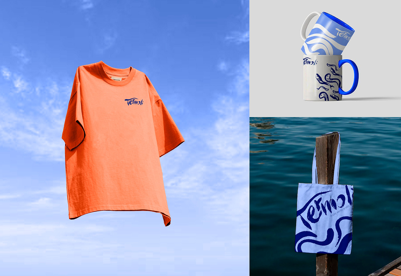
Merchandise